PROJECT TITLE
Major Rebrand: Senior Copywriter at ResMed (Australia)
PROJECT OUTLINE
ResMed had suffered from a confusion internally about its identity. When asked to describe the type of company it was, some would say, it’s medical, others would say its manufacturing, or its R&D. The objective was to get everyone behind the idea that ResMed was a powerhouse brand that stood for QUALITY, with major investment in innovation (since quality and credibility was at the crux of any medical manufacturer device company)
ResMed: Destination Brand Power
The second example is an excerpt from the Employee Style Guide I wrote for ResMed, which was subsequently used as a global resource, setting the benchmark for consistent communications in AsiaPacific, USA and Europe. The Style Guide clearly explains what the ResMed brand means and how it should be upheld.


Click here to view the complete Employee Style Guide. (PDF- 1.3MB)
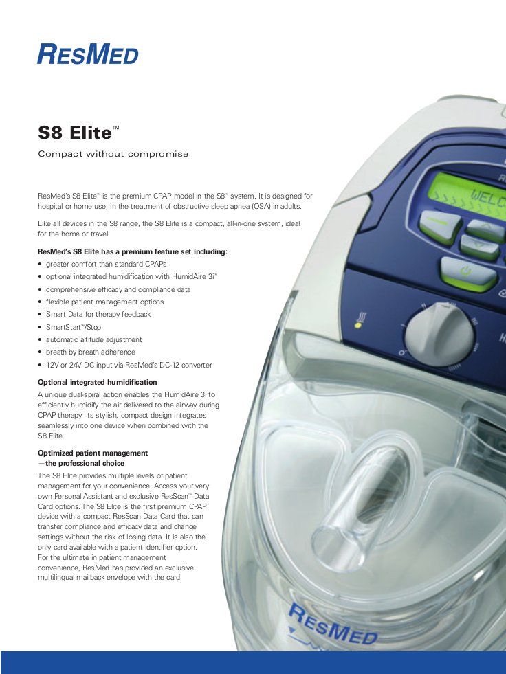
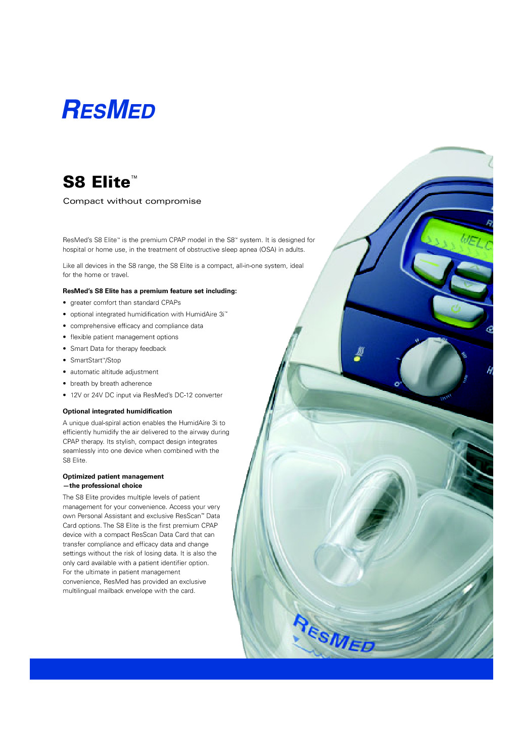
ResMed has a varied reach including medical/clinical and patients. All collateral and touchpoints were rebranded and redesigned for a premium look and feel.
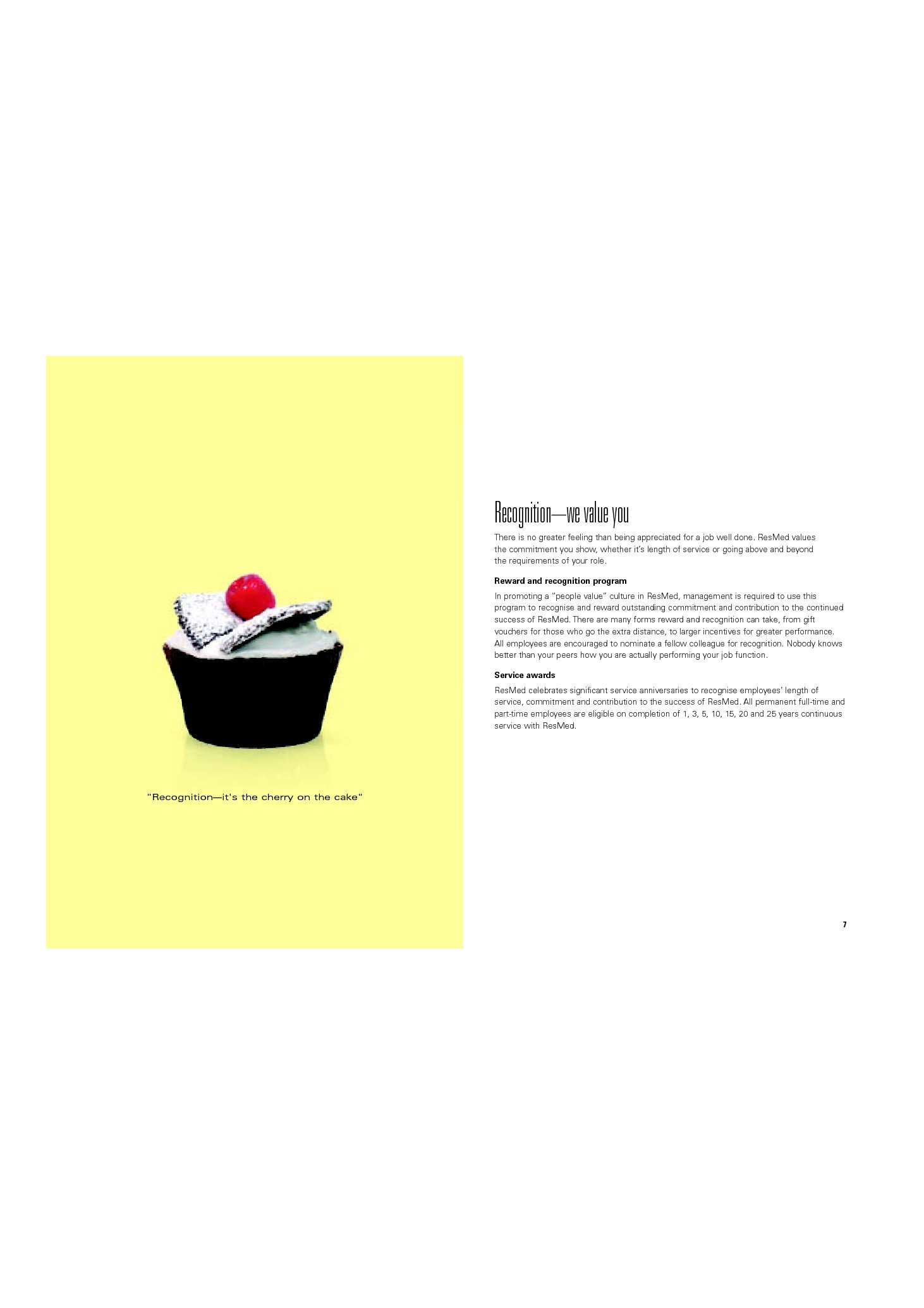
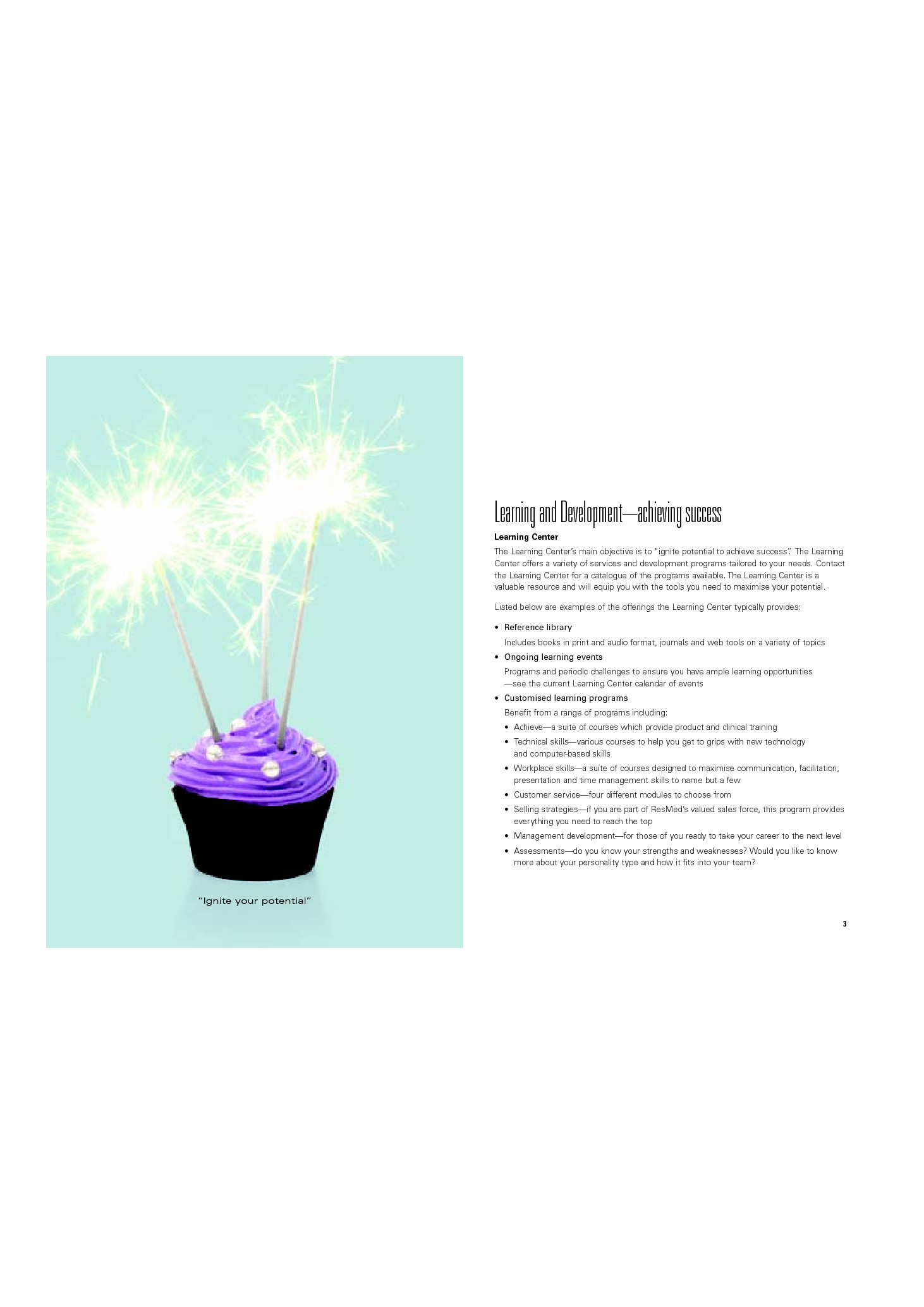
We rebranded and created all our internal communications and launched a simultaneous campaign that showed REsMed valued its employees and they would be rewarded for their efforts. All collateral was designed to position ResMed as an employer of choice in a campus style environment.
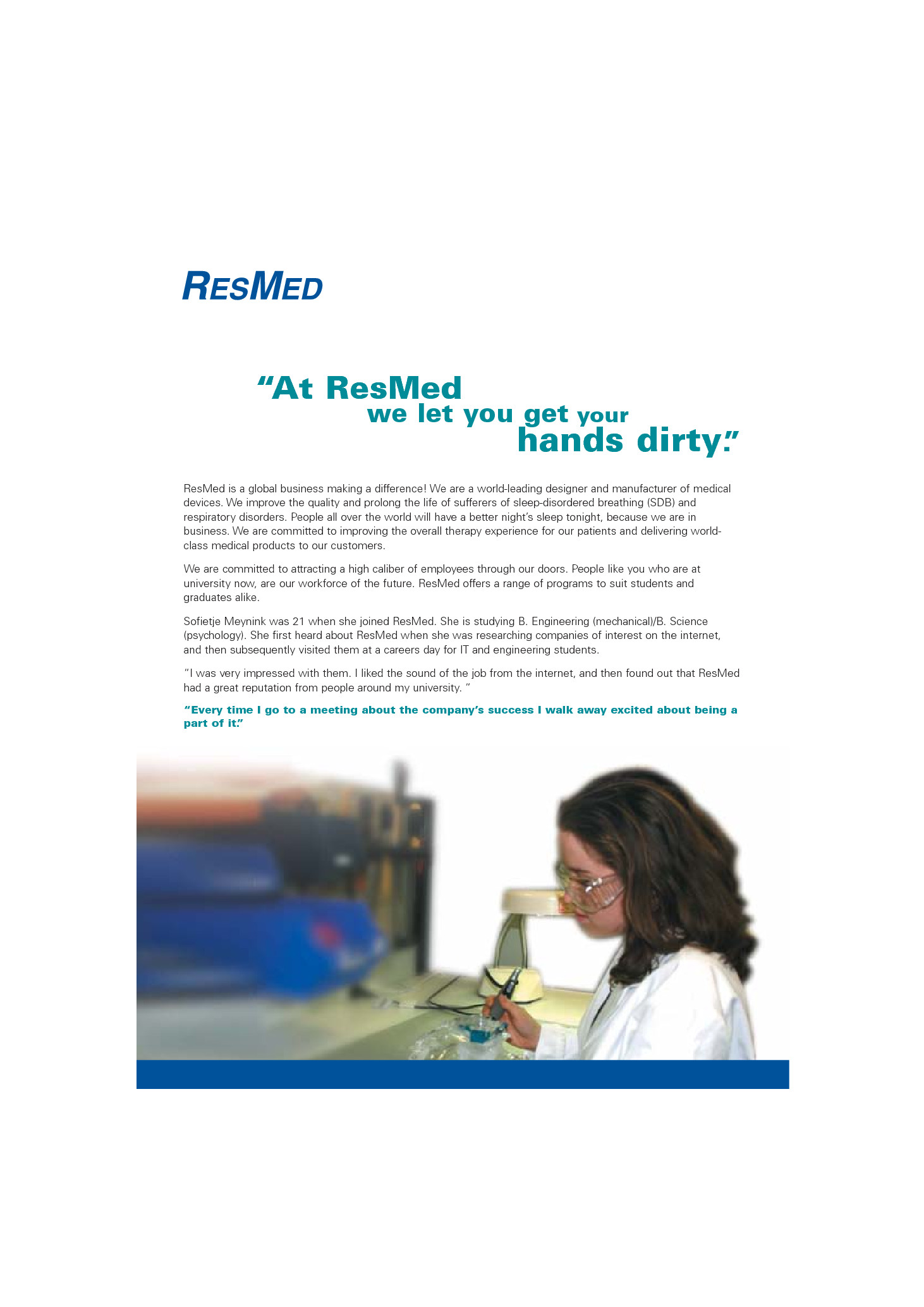
One of our graduates Sophie took part in our graduate recruitment progamme showing that as intern she actually was able to make a difference and not merely consigned to making the tea and coffee. ResMed was keen to show the world they were growing and they were investing in helping their employees grow too.
 Send to Kindle